1950s Diner Illustration
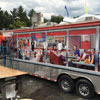
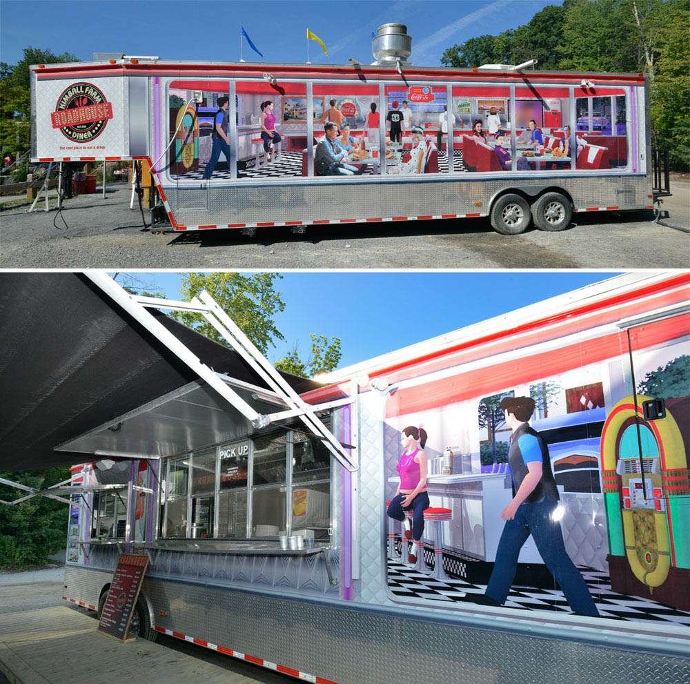 Photos compliments of Belgraphix
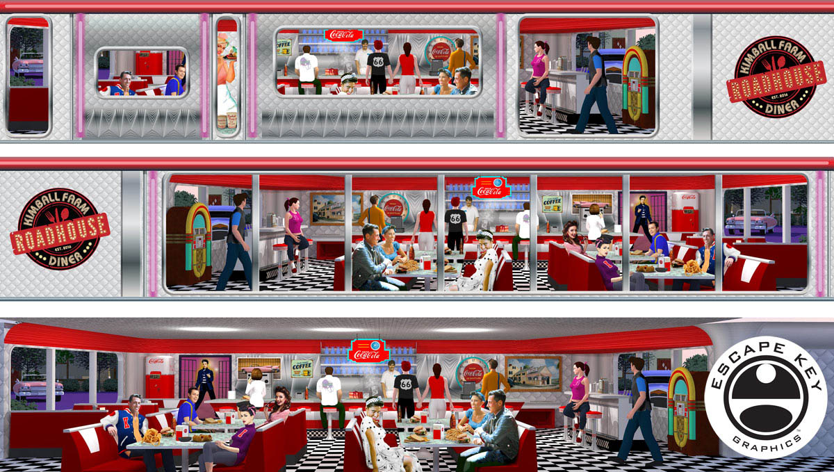
I just completed this rendering for my friend Barry Belotti at Belgraphix Marketing Group in Massachusetts.
Barry designed the logo. I should mention that I used stock models and photography extensively on this project. Art and graphics hanging on the walls was supplied by the client. As a result, I don't take full credit for this as illustration, but rather see it as a problem solved for a client. I used what was available rather than working from scratch whenever possible and thereby reduced labor and cost. This ensured that I could hit the tight deadline. Although I used a lot of stock stuff it did require the skills of an artist to put it all together and have it still look like one cohesive image.
The Challenge...
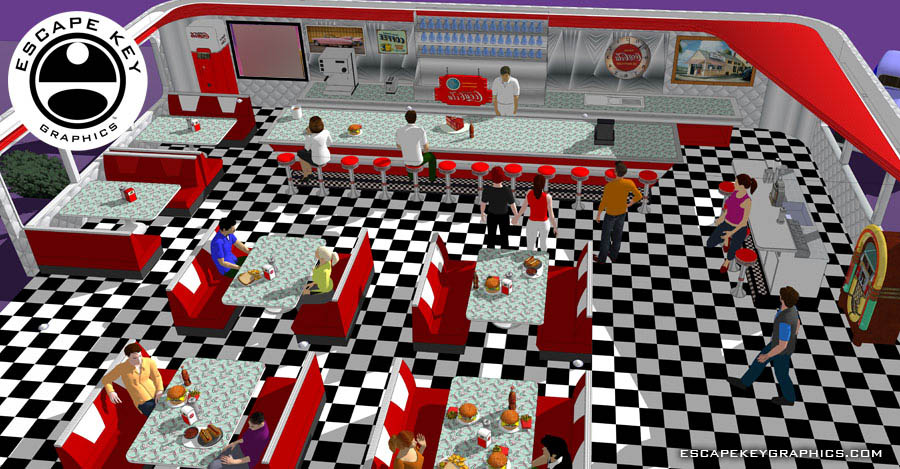
 The client has a food truck and wanted a 1950s diner style illustration for a vinyl wrap. What the client originally envisioned was more like the walls of the interior of the diner (Trompe l'oeil style). One of his "must haves" was the stylized bar stools. Unfortunately, there was steel plating around the bottom of the actual truck and there just wasn't room for renderings of full scale stools. The solution we opted for was a more 3D, deep perspective rendering.
The Illustration...

The "exterior" was created with Illustrator with windows for the interior to show through. The waitress peeking out the small window was existing art that the client wanted integrated somehow. She was part of the overlaying Illustrator file. The "interior" was mostly created in Sketchup and rendered and then edited with Photoshop. Some people are stock 3D models, some are retouched stock photography and some are a combination of both. There is a little bit of drawing in Photoshop as well.
I took a pragmatic approach to this and used what was available rather than working from scratch whenever possible. The project had more in common with my architectural renderings of a restaurant I did a few years back than the more art deco style illustrations I'm frequently known for. The project also has some in common with my recent 3D maps, but this project was on a human scale which was nice for a change.

I designed the illustration in such a way that it could be flipped horizontally and used on both sides. Anything with text on it had to be flipped individually as well as a few other adjustments. Even with that extra hassle this method reduced labor and cost dramatically and insured a consistent look.
The Installation...
Barry Belotti (Belgraphix Marketing Group) supplied these photos and Boston Building Wraps did the installation.

