Logo Designs
![]()
![]()


![]()


![]()

![]()
![]()
Logo design is an exercise in controlled restraint. A good logo communicates a concept using as little visual information as possible. It is a monument to minimalism. That is what I was taught in school, and it is engrained in my thinking.
Of course, I am frequently approached by clients who prefer a more complex illustration. I respect that approach, and I am always happy for an excuse to do illustration work as well. As you can see from this collection, I have made many logos over the years, ranging from stripped down to richly detailed.
How Logo Design Has Changed
When I was in school, the rules were clear. A logo needed to reduce to a tiny size, like on a letterhead, and still be legible. It also needed to work in one color for fax machines and simple printing. Printing constraints have changed since then, and the strict requirement for a one color version has largely faded. Logos have taken somewhat of a back seat in corporate style sheets, no longer governed by unbreakable rules. That shift has opened up opportunities for more elaborate and illustrative designs.
A Case Study: Adventureland Narragansett
I am particularly fond of the Adventureland Narragansett logo. You can see it in use on their website at Adventurelandri.com. From the start, I had a strong feel for this one. The client had a clear idea that they wanted a lighthouse in the logo, and they knew it would not need to be reduced to a tiny size or limited to one color. They wanted something illustrative with an eye catching palette. What we ended up with holds up well when scaled down, but at larger sizes the viewer can appreciate details that are not immediately obvious. There is more there than first meets the eye.
Other Logos in This Collection
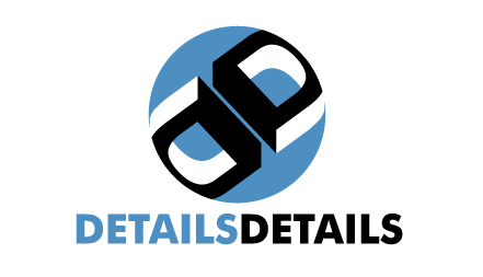
The Details Details logo was created while I was working full time for The Catamaran Company. It represented one of their satellite companies and was in use for many years. I noticed recently that it has been replaced, but it served them well for a long time.
The Got Pasties and Cluster Ducks logos might look like sophomoric humor from my college days, but both were actually for real clients. Sometimes the best work comes from projects that do not take themselves too seriously.
Some of the logos you see here were proposals that did not get final approval or were never utilized for other reasons. But you would be hard pressed to guess which ones. I treat every proposal with the same level of attention I give to work that goes straight to print.
Your Logo
If you need a logo, whether clean and minimal or richly detailed, contact me. I am comfortable working in both modes and can help you find the right fit for your brand.
PORTFOLIO SELECTIONS
- Custom illustration & covers: Featuring bespoke illustration, book and magazine covers, hand-drawn maps, and building renderings.
- Fine art & murals: Including one-of-a-kind paintings and drawings, the Custom Halftone Series, and large-scale murals.
- Design & motion media: Covering graphic design, plus video and motion and animated illustration.
- Mapping by application: Tailored maps for marine events, hospitality, waterfront, property, transit, municipal, recreation, and navigation needs.
- Additional creative work: Includes editorial covers, vehicle graphics, concept renderings, and public art.
- Mediums & formats: Ranging from digital vector and isometric projection to traditional paint, line art, GIS-based, aerial-style, and halftone.
- Software expertise: Proficient in Photoshop, Illustrator, SketchUp, InDesign, and Premiere/After Effects for motion.