A Vector Based Art Deco Style Book Cover Illustration with a Retro Feel
Illustrator and Designer: John Potter - Escape Key Graphics
Client: Matanzas Press
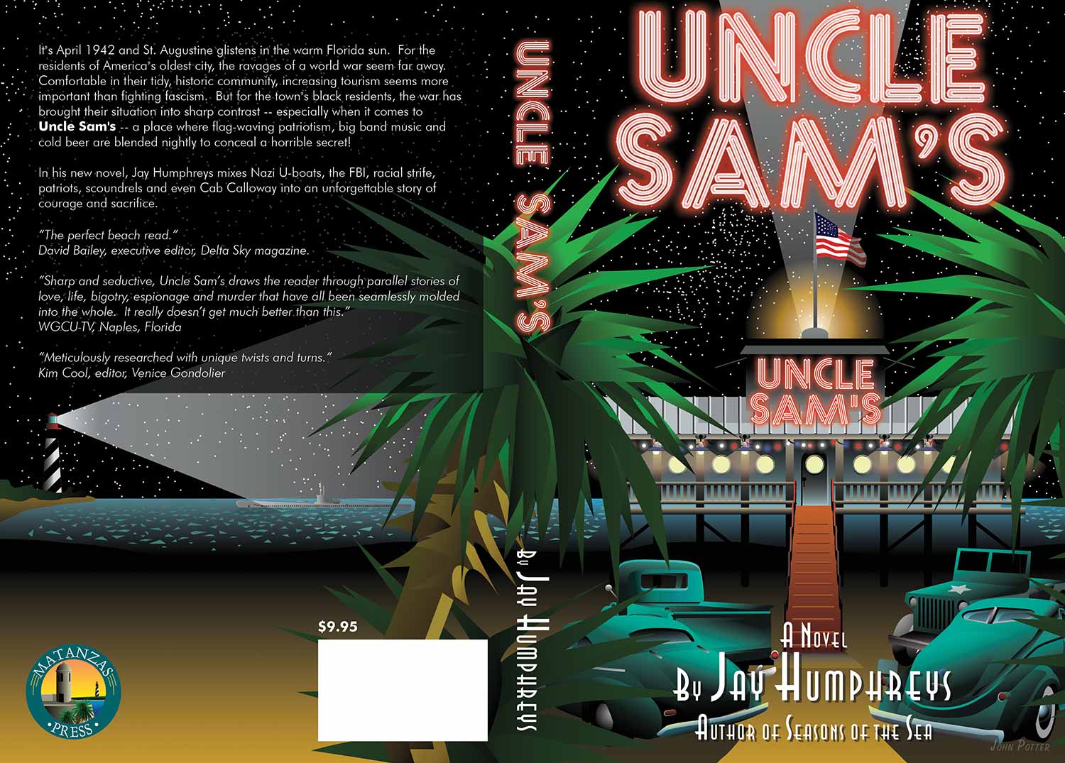
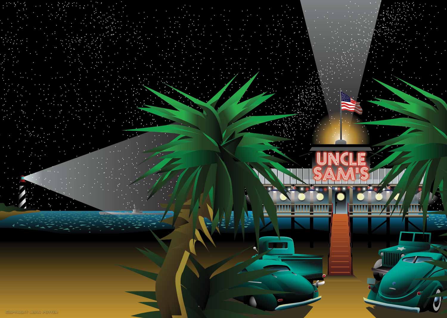
I was commissioned by Matanzas Press to illustrate and design the cover for Uncle Sam’s by Jay Humphreys. While the client had a general concept in mind, I developed several preliminary sketches to explore different directions. We ultimately chose a straightforward, engaging view of the beach club featured in the novel, capturing the lively Florida beach bar atmosphere with details such as porthole windows and retro elements, including World War II–era vehicles in the parking lot.
The illustration extends seamlessly across the back cover, allowing me to incorporate additional plot elements, including a U-boat and a lighthouse. These details add narrative depth while remaining intriguing without revealing key story points, enticing readers to explore the book further.
Typography was carefully designed to complement the illustration. The title features a neon-style font with a soft outer glow, echoing the signage of the beach club in the story. The author’s name is set in an art deco font, creating a vintage yet refined aesthetic, while the back cover description uses a clean, simple sans serif font for readability.
The result is a visually striking, cohesive design that communicates the novel’s setting, tone, and period, while drawing readers in with both style and narrative hints.
Matanzas Press
Logo Design, Book Cover Design and Illustration, Website Design
Testimonial: With nothing more than my poorly defined concept to work from, Escape Key Graphics created a dazzling book cover design that not only met, but far exceeded my expectations--really amazing work!
Jay Humphreys,
Matanzas Press
COVER ILLUSTRATIONS:


ABOUT COVER ILLUSTRATIONS:
There is a well-known saying that you shouldn't judge a book by its cover, but in reality, people do. If you have invested time, money, and creative energy into a book, magazine, or other publication, having a strong, eye-catching cover is essential. Authors and publishers often tell me that my cover illustrations have helped sell more copies than the content alone, opening doors to readers who might not have discovered the work otherwise. While this may seem surprising, it underscores the importance of compelling visual storytelling in capturing attention and communicating ideas at a glance.
Illustration offers unique advantages over photography for cover design. While photography can be a powerful choice in certain situations, illustration allows for the clear depiction of abstract concepts, fictional settings, or ideas that cannot be photographed. It also provides complete control over color, lighting, and composition, down to precise digital detail. This flexibility allows each cover to convey mood, tone, and narrative in a way that is fully tailored to the content it represents.
Over the years, I have created cover illustrations for books, magazines, and a wide variety of publications. The earliest work currently displayed on my site is the 2011 cover for Phillip Singer: An Accounting, which was hand-painted in oil, photographed, and then completed digitally using Illustrator and Photoshop. Today, most of my cover illustrations are produced entirely digitally, with a focus on vector-based techniques that ensure crisp, clean, and scalable designs suitable for print or digital media.
Each cover I create is designed to capture attention, communicate the story, and elevate the publication's visual identity. Whether for a book, magazine, or other creative project, my illustrations combine artistry, precision, and concept-driven design to make a memorable first impression that engages audiences and enhances the overall impact of the work.
WORK DONE IN ADOBE ILLUSTRATOR:


PORTFOLIOS
- Illustration Portfolio: Start here for custom illustration and book covers. You can also browse illustrated maps and architectural rendering.
- Fine Art: I offer original paintings and drawings, including my Custom Halftone Series. You will also find mural work here.
- Graphic Design & Motion: View my graphic design portfolio. After that, explore motion design and animated illustrations.
- Maps by application: I create illustrated maps for boat shows, resorts, marinas, real estate, transportation, transit and parking, towns and cities, parks, and wayfinding.
- Additional project types: I also produce cover illustration, vehicle and vinyl wraps, proposal renderings, and street art.
- Illustration methods: My techniques include vector, isometric and axonometric, painting, black and white, GeoData maps, overhead maps, and custom halftones.
- Software portfolios: I work primarily in Adobe Photoshop, Adobe Illustrator, SketchUp Pro, and Adobe InDesign. For motion projects, I use Premiere Pro and After Effects.