Map Keying Methods
Map Keying Methods - There are a lot of different ways to key a map and choosing the right one can be difficult. Different maps and applications can make one method preferable above others. I'm going to share a little of what I've learned.

I generally try not to repeat numbers or letters if possible. Just having one number eleven a different color than another, for instance, still leaves room for confusion. Commonly when a map has categories of points of interest it's tempting to number each category starting with one, but I encourage continuing so that no character repeats. The Miami Beach Neighborhood Illustrated Map, Palm Beach International Boat Show Map and STAR Center Campus Map are a examples the non-repeating method I encourage.
Usually I find that my clients want the first few items in the key to be what people are most frequently looking for regardless of the method of listing on the rest of the map. After those first few points keys may be alphabetical or alphabetical by category like The Miami Beach Neighborhood Illustrated Map. These methods favor finding a location on the map and then seeking it's description in the key.
Other techniques of ordering the key include using a left to right and then down location method (like reading) as in The Wild Animal Sanctuary Map, or a just left to right policy like The Stuart Boat Show Map. These methods favor finding a description in the key and then finding the location on the map.
Another technique is following the expected path of the person using the map like Dinosaur World Florida. This makes using the key first or finding locations first moot, but can only be applied in pretty specific circumstances.
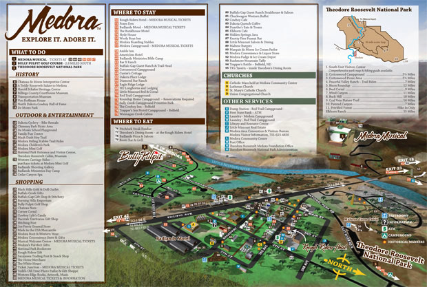
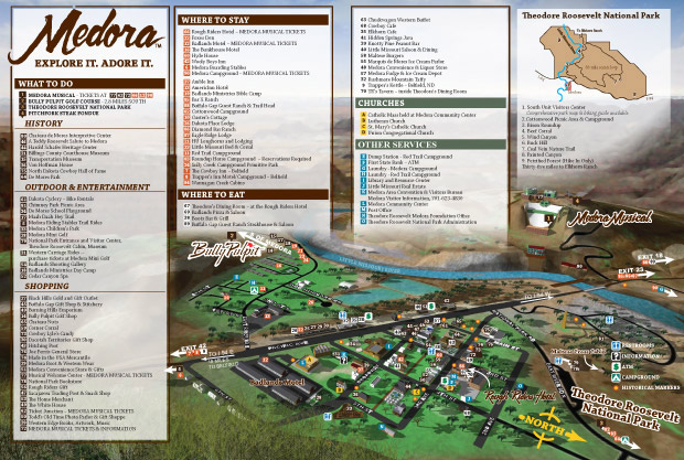
The Theodore Roosevelt Medora Foundation originally had the key on their map of Medora, ND numbered sequentially. After getting some feedback from users of the map they decided to let the placement of the numbers on the map determine the numbering in the key, but retained the same order. The original system favored the map user finding a location on the map and then seeking it's description in the key. The new method favors finding a description in the key and then finding the location on the map. The map numbers now go from left to right making finding one of over ninety numbers on the map much easier. The fact that the key doesn't read 1,2,3 really doesn't matter. The map user can still easily find what they want in the key which is broken into categories and then quickly locate the corresponding number on the map. Some educated assumptions have to be made about how people will use a map and although a very high standard should be set from the beginning there still may be room for improvement later. No one method is perfect and if you have a map that's used in multiple print runs or for a recurring event it's smart to listen to the people using it, get feedback and make improvements if possible.

Original Keying (You will need to see the full size to see the keying properly)

New Keying (You will need to see the full size to see the keying properly)
I have even made a few maps that didn't use a key. Flamingo Garden's map jumps to mind although there is a key for plant identification. Also using only a minimal key is The Newport International Boat Show Map. Having no key can be really cool, but it's just not a workable solution for most situations. I've also made some maps that primarily used icons as a keying method. That can make for a fun look and most icons should be self explanatory even without the key.
Speaking of icons, I feel that icons should fulfill certain relatively consistent functions on a map. I personally feel that one function of icons is to identify important features at a venue to anyone even if they don't read the language used on the map. Icons can provide information about the location of things like restrooms, first aid and perhaps food or concessions to anyone using a map. For that reason I think the most fundamental features and any emergency services at a venue should be icons. I usually also like to use icons for recurrent points of interest as well, for instance bus stops or parking. A single icon can indicate all relevant locations with a single listing in the key.
It seems like there is always more to learn about make keying and making a better user experience for maps. I learn something new most every day. I am sure I will make more posts like this in the future.
If you enjoyed this article you may also like...
